A video’s thumbnail is the first thing a viewer sees and often what determines whether that viewer will decide to watch the video or not.
A good thumbnail goes a long way. Here are a few important guidelines.
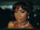
1. Show a face (or two).
People respond positively to human faces and often draw their emotions from the faces they see. This doesn’t mean you can only include faces with positive emotions. Extreme, easily readable emotions will generally work well, whether they’re positive or negative. Often, a big sad face in a thumbnail can suggest the video is funny, especially if it’s presented against a bright color scheme.
If you include emotionally clear faces in your thumbnail, then your viewers will have an instant expectation for the video and are far more likely to see it as worth watching. People also just like looking at human faces, so even if there’s no emotion, at least the viewer knows it’s not a boring video with a bunch of screengrabs.
The excited smile that Zoella puts on many of her thumbnails is a great example of using facial emotions to create an engaging image.
2. Choose your colors wisely.
Colors are very important in order to catch people’s eyes. Many high-profile Youtubers use bright colors for their thumbnail backgrounds in order to pop against the white and gray backgrounds of the Youtube site.
It’s also a good idea to use complementary colors in your thumbnail design to produce visual contrast. If you go to the 3:10 mark in this video, you can see how to pick out good colors to pair with each other.
3. You can use text, but don’t use too much.
Remember that when people see your thumbnail, they will also be seeing the title of the video. That means you don’t necessarily need to use text, but putting text on your thumbnail allows you to display the words in the way you want rather than in Youtube’s automated layout. You can use color contrast to make words pop or experiment with fonts to help augment the text.
If you do choose to use text, though, try to keep it to no more three to five words. More words will produce a cluttered thumbnail. Often, just one or two words can produce an enticing image.
Look at this thumbnail from the popular channel Smosh.
4. Keep the overall look consistent from video to video.
Think about the way that people move through Youtube. They usually choose the next video to watch from the suggested videos at the side of the page. If someone is already watching a video from your channel, you want to make sure they stay on your channel rather than clicking away to someone else’s video.
To do this, it’s obviously important to have good content, but you can also help yourself out by keeping the design of your thumbnails consistent. Viewers will quickly associate the video with your channel, especially because many of the suggested videos will also come from your channel. With so many similar-looking options in front of them, most viewers will take the time to choose from those videos rather than navigate to another channel.
You can also add a logo or watermark to your thumbnails to make it completely clear to your audience. This VICE video thumbnail shows off a really strong logo.
5. Most importantly, represent the video accurately.
A misleading thumbnail may get you more views and clicks on one specific video, but it will not help you grow your audience. People will leave your channel immediately if they feel misled, and the resulting slew of dislikes will plummet your video in search rankings.
The thumbnail from this video shows viewers exactly what the video is about.
High-quality thumbnails can go a long way towards drawing in new viewers and retaining them as audience members. Make sure you’re getting the most out of your thumbnails.
Interested in getting your YouTube video discovered by masses of targeted fans? Click this link: www.promolta.com
Matt Cummings grew up in the Bay Area and now attends UCLA. He enjoys sports, music and comedy.


Leave a Comment